01
Design
Pages, layers, and artboards. Edit directly on the canvas, with dedicated desktop, tablet, and mobile views.
Design on the canvas. Build with Zaoly Kit. Hand off React components your team can use in other products.
Zaoly turns visual decisions into structured building blocks with variants, design tokens, and code, so design and development can keep working from the same source.
From the first page to a reviewed component, Zaoly brings designers a canvas, system tools, and handoff in one workspace.
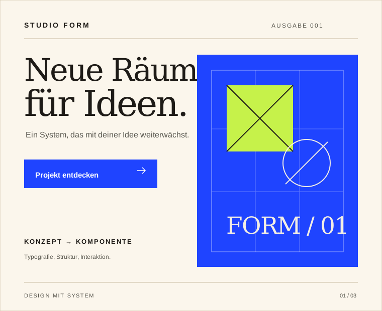
Open editorIllustration of editor capabilities · not an app screenshot
Pages, layers, and artboards. Edit directly on the canvas, with dedicated desktop, tablet, and mobile views.
Kit atoms, masters, named variants, and brand tokens give designs a reusable structure.
Assets, team presence, comments, and named versions keep decisions and changes traceable.
Preview, accessibility preflight, and React handoff connect visual design to implementation.
Text, Button, Input, Card, and Layout are the starting point. Combine these atoms into your own components and build a system that grows with your ideas.
Explore Zaoly Kit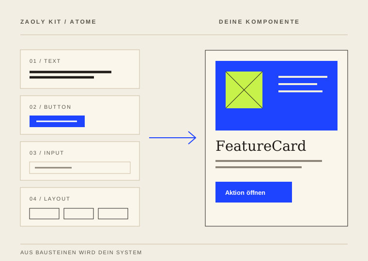
Create named component variants and choose the right state for each instance. Keep the same structure while changing its expression with intent.
Illustration of two named master variants
Bind editor components to token paths instead of fixed values. Change a value in the local pack, and bound components pick up the new style when you return to the editor.
Open Token StudioSelect a card, edit its value in the side dock, and see the result on the token. Colors, dimensions, and derived values each have a dedicated tool.
Edit HEX, RGB, HSL, and OKLCH in one place. Saved local values are clearly marked as overrides.
Move the scale beneath a fixed marker with the infinite wheel. The preview responds as you adjust.
Derive a value from another token. Its resolved value stays visible right in the field.
Cards, JSON, and CSS. Copy or download pack values. Admins can review a JSON import before applying it.
Open Token StudioIllustrations of the local Token Studio · sample values and drafts
Font family, weight, and size are token values. Bind editor text to the same path, and a local pack change carries the new expression to every connected preview.
Illustration of the product principle · local sample override
These views show Zaoly with sample data: a local token pack and the Kit Playground, where components, code, and live preview sit side by side.
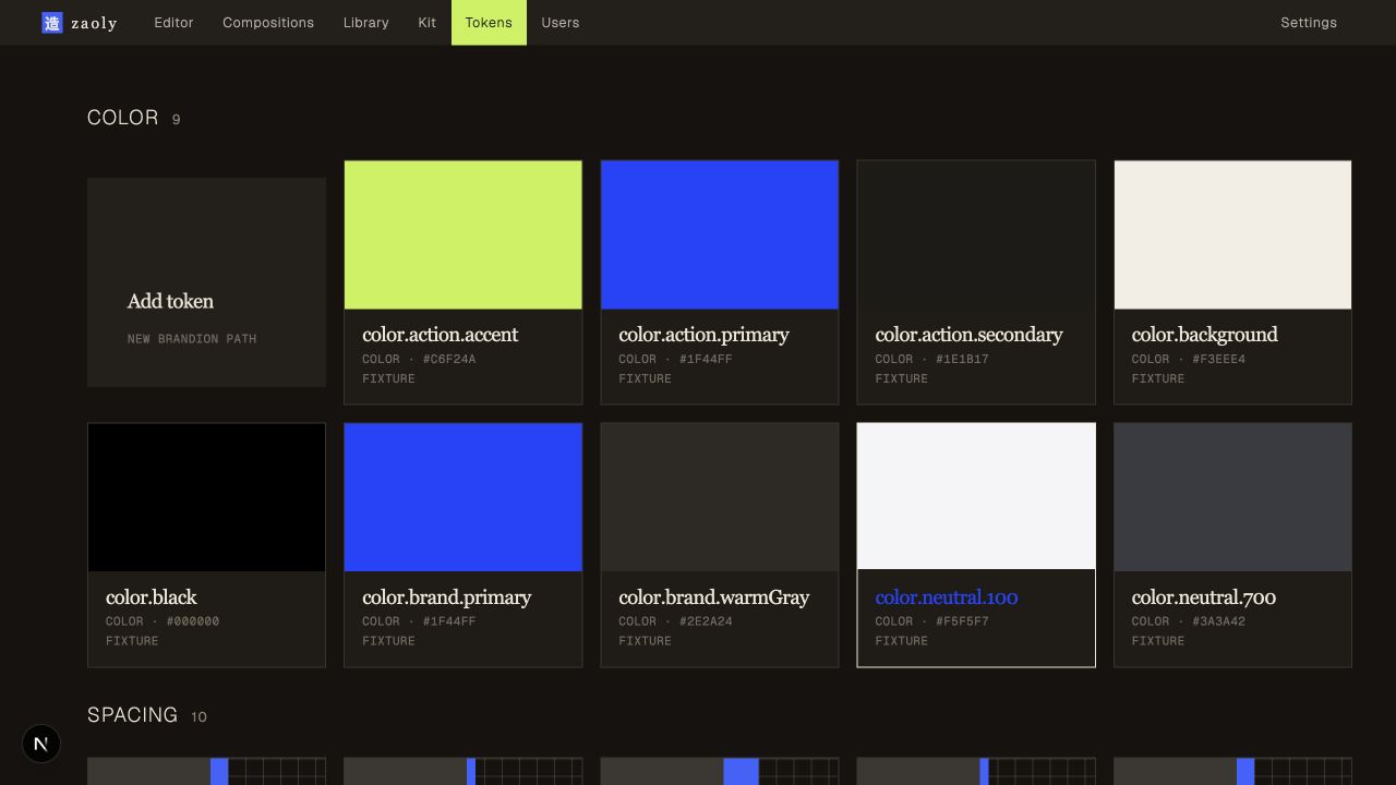
A local token pack for colors, typography, and spacing. Token paths connect values to components in the editor.
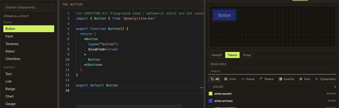
Kit atoms, TSX, and live preview sit side by side, so the technical structure stays visible while you design.
Text, Button, Image, and Layout are Kit building blocks. Choose a different layout and rearrange the same atoms—from a calm split hero to a stacked landing page.
Illustration of two intentionally designed layout variants
Switch between desktop and mobile in the editor. Shape the layout for both widths so your page stays clear, even on a small screen.
Illustration of two designed breakpoint views · 1440 / 390 px
From the first shape to the code, every step builds on the same component.
Build a structured component and layout directly on the canvas.
Masters, variants, and tokens make the design reusable.
React code and review notes give the team a concrete starting point.
Workflow illustration · sample component and React snippet
Your projects have different goals. Well-made components can still live on in more than one context.
Turn a visual building block into a React module with imports, token context, and guidance for integration into other React projects.
01import { Stack, Text, Button }02from '@zaoly/site-kit'0304export function FeatureCard() {05 return (06 <Stack>07 <Text>One idea. Many places.</Text>08 <Button>Explore</Button>09 </Stack>10 )11}Planning a team rollout, want to learn about hosting and AI features, or have questions about developer handoff? We’ll help you find the right next step.
hey@zaoly.appDesign today what keeps working as a component tomorrow.
Open editor